← Portfolio
CASE STUDY 04
Global Navigation Redesign
One Navigation System, 50+ Properties
UX Strategy · Competitive Research · Interaction Design · 2025
NORTH STAR
Navigation should feel like one company, not fifty separate ones.
A research-validated system governing IA, interaction, and visual standards across every Ubisoft web property.
Ubisoft's global navigation is the connective tissue across 50+ web properties, but it suffered from inconsistent patterns, weak information architecture, and no unified research foundation.
CONTEXT
Identified that Ubisoft's navigation failed players because each property optimized for itself instead of for the player's journey across all of them. Led a 6-month effort to build the evidence base for that argument — benchmarking six gaming platforms, 24 research participants, and a design system that treats 50+ web properties as one product
MY ROLE
Over 6+ months we ran a rigorous multi-method discovery phase covering internal heuristic evaluation, competitive benchmarking across the six largest gaming platforms, stakeholder interviews, surveys, card sorting, tree testing, and usability sessions with 13 participants across desktop and mobile. Synthesized findings informed a revised IA and navigation structure, which we prototype-tested before incorporating all feedback into final designs for developer handoff.
PROCESS
50+
Web properties
mapped
24
Research
participants
6
Platforms
benchmarked
6 mo.
End-to-end
engagement
Design Process
01
Context & Problem Statement
Ubisoft’s fragmented web ecosystem is evolving toward a unified destination. A discovery phase was launched to redesign the navigation and lay the foundation for the future.
02
External Benchmarking
Analyzed navigation across EA, Battle.net, Steam, Epic Games, Xbox, and PlayStation — cataloguing IA patterns and interaction conventions.
03
Card Sorting & User Interviews
Synthesized research into a unified navigation taxonomy — standardizing labels, hierarchy, and cross-property wayfinding structure.
04
User Research & Validation
Ran moderated sessions with 24 participants across 4 rounds to validate IA structure, labeling decisions, and navigation hierarchy.
05
Final Designs
Delivered interaction specs, component documentation, and responsive behavior guidelines ready for engineering handoff.
Before the design research process
Ubisoft.com

Ubisoft Store

Assassin's Creed

Rainbow Six Siege

Heuristic evaluation
A heuristic evaluation is an expert review of a user interface against established usability principles. It identifies friction points, inconsistencies, and accessibility gaps before reaching users.
10 Usability issues were found on Ubisoft.com during the evaluation.
Severity ranged from Critical to Low
Critical
Download Connect button was not focusable
Fixed
Critical
Subcategories are visible on desktop but hidden on mobile
For revamp
Urgent
Missing focus state indicator on product cards
For revamp
High
Mega menu opens at hover
For revamp
High
Log-in button doesn't have a label
For revamp
Medium
Connect installer instantly downloads - lack of error prevention
For revamp
Medium
Mega menu buttons 'View all games' & 'View all' look the same but don't work the same
For revamp
Medium
Inconsistent hover states
For revamp
Medium
Inconsistent spacing and click zones
For revamp
Urgent
On mobile, Download Connect CTA still redirects to decommissioned Connect Companion app
Fixed
COMPETITOR LANDSCAPE
Persistent global header
Present on all pages
Ubisoft.com

EA.com
Battle.net
Steam
Epic Games
Xbox
PlayStation.com
Account access in nav
Sign in / profile link
Ubisoft.com
EA.com
Battle.net
Steam
Epic Games
Xbox
PlayStation.com
Search in nav
Global search in nav bar
Ubisoft.com

EA.com
Battle.net
Steam
Epic Games
Xbox
PlayStation.com
Cross-property consistency
Unified nav across all sub-sites
Ubisoft.com
EA.com
Battle.net
N/A
Steam
Epic Games
Xbox
PlayStation.com
Mobile nav parity
Equivalent mobile experience
Ubisoft.com
EA.com
Battle.net
Steam

Epic Games
Xbox
PlayStation.com
Supported
N/A
Not offered
Not supported on web
Analytics Findings
Analytics Findings
Navigation is used but fragmented
Global navigation drives discovery, while users rely on icons, logos and footer to complete key tasks.
01
Utilities outperform content
Download Connect, Search, Login and Language are among the most clicked items across the ecosystem.
02
Desktop=exploration | Mobile=utility
Desktop users browse games and franchises, mobile users seek quick access to support, account and services.
03
Gamesites act as hubs
Franchise and local navigations generate stronger engagement than the global nav.
04
Ubisoft.com is a jumping off point
Ubisoft.com acts as a dispatcher, funneling traffic into four primary channels: the Store (13%), Help (12%), Gamesites (10%), and the Marketplace (9%).
05
Journeys are non-linear
Heavy redirections between Store, Gamesites, News and Help, with Ubisoft.com acting as a traffic dispatcher.
06
Key Finding from the Discovery
Players engage through games, drive action by specific needs, and require unity.
Our next navigation must unify fragmented touchpoints, creating a single, consistent player journey across discovery, purchase, and play.
01
Players think by game, not corporate silos
Design must unify all content (news, store, support, DLCs) under a single, consistent game-centric experience.
Interviews
Card Sorting
Benchmark
02
Discovery and Purchase are distinct phases, but require a seamless bridge
Players naturally separate discovery (Ubisoft.com, Brand sites) from purchase (Store), yet expect a seamless bridge between both.
Interviews
Card Sorting
03
Ubisoft.com is mostly used as a service entry point
Visits are driven by core functional intent: Connect downloads, Marketplace access, and Account/Support management.
Survey
Analytics
04
Essential utilities must be ever-present
Account, Support, and Language are treated as always-on actions and must maintain maximum global visibility.
Survey
Interviews
Analytics
Prototype Test Results
High System Usability with Localized Friction
Functional Pillars Validated
Core utilities are Ready - News, Ubisoft+, and Account management achieved perfect success rates. The 85.7 SUS score confirms the framework is structurally sound; friction is localized to taxonomy and labels.
01
Steam/Epic Discovery Gap
Users expect a single flow to learn and purchase. 10 of 13 participants failed to find Coming Soon titles, expecting them on Home or Games rather than in the Shop tab.
02
Wishlist False Positive
While 11 of 12 found the wishlist, only 2 of 12 looked in the Profile menu - design success was masked by a scavenger hunt navigation pattern.
03
Search is a Primary Shortcut
5 of 13 players attempted search first for discovery; participants expect robust tools to bypass complex hierarchical navigation.
04
Corporate Silos Hide Content
Non-gaming media like Netflix content is invisible under the About label; 12 of 13 participants expected it elsewhere, such as in the news section.
05
Task Completion Overview
Score Card
Completion Rate: How many of the users were able to complete the task
Expectation Rate: How many of users expected to find the solution where it was
Next Steps: Action to take for the final designs
Find out what game is to be released next.
Completion Rate
4 of 13
Expectation Rate
5 of 13
Next Steps
Change prototype
Look for other media or products (not games).
Completion Rate
7 of 13
Expectation Rate
13 of 13
Next Steps
Change prototype
Find a way to check your wishlist.
Completion Rate
11 of 12
Expectation Rate
2 of 12
Next Steps
Change prototype
Look for the Rainbow 6 Siege Marketplace.
Completion Rate
12 of 13
Expectation Rate
13 of 13
Next Steps
Further research
Find a way to get information if you wanted to find a job in Ubisoft.
Completion Rate
12 of 13
Expectation Rate
9 of 13
Next Steps
Keep as is
Find a section where you can resolve an issue for a game that you are currently playing.
Completion Rate
12 of 13
Expectation Rate
11 of 12
Next Steps
Keep as is
Log into your account.
Completion Rate
12 of 13
Expectation Rate
11 of 12
Next Steps
Keep as is
Seek the latest updates/news on Ubisoft games.
Completion Rate
13 of 13
Expectation Rate
13 of 13
Next Steps
Keep as is
Seek information about Heroes of Might & Magic.
Completion Rate
13 of 13
Expectation Rate
13 of 13
Next Steps
Keep as is
Find general information about Ubisoft+ Subscriptions.
Completion Rate
13 of 13
Expectation Rate
13 of 13
Next Steps
Keep as is
Find a way manage your Account.
Completion Rate
12 of 13
Expectation Rate
12 of 13
Next Steps
Keep as is
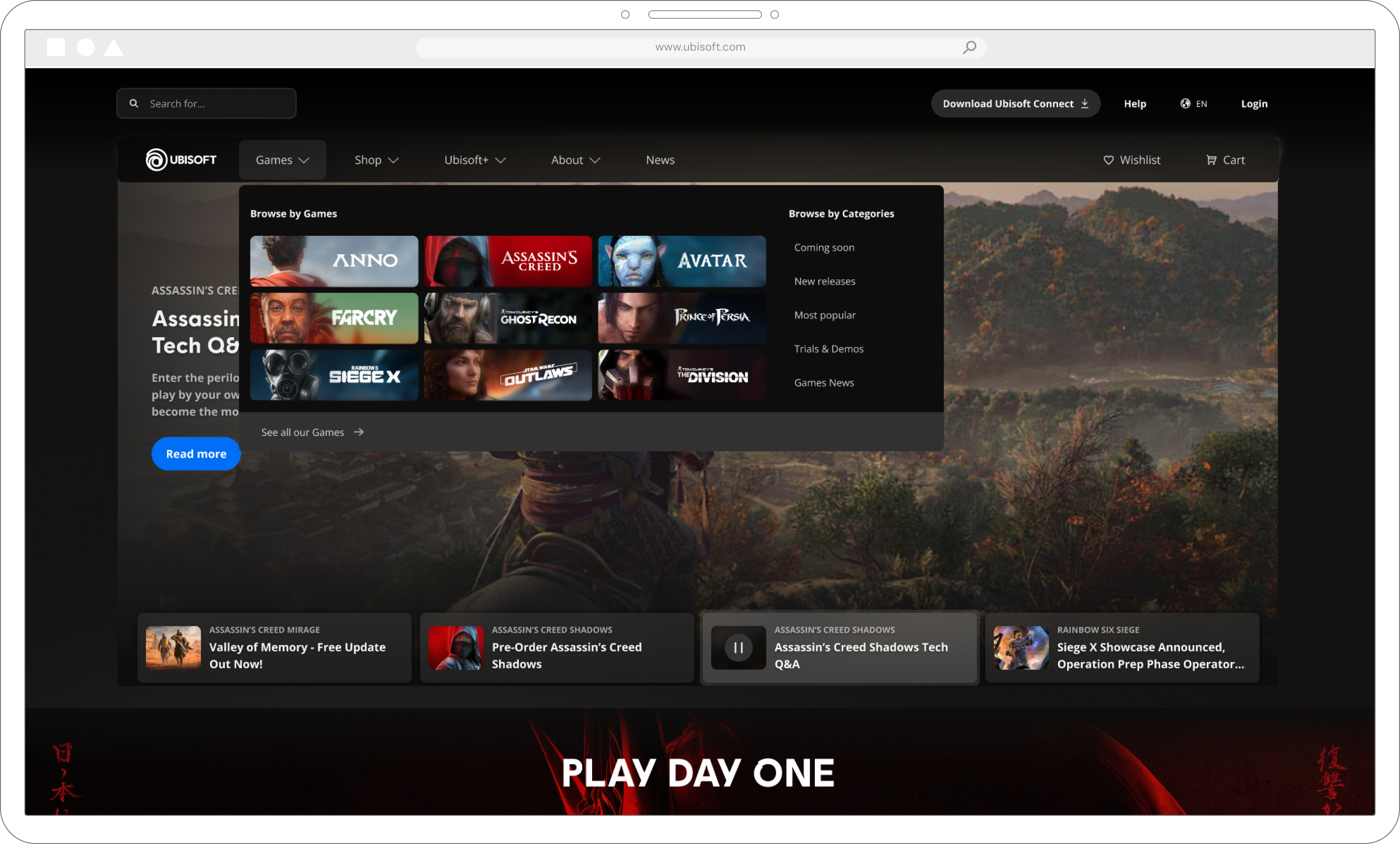
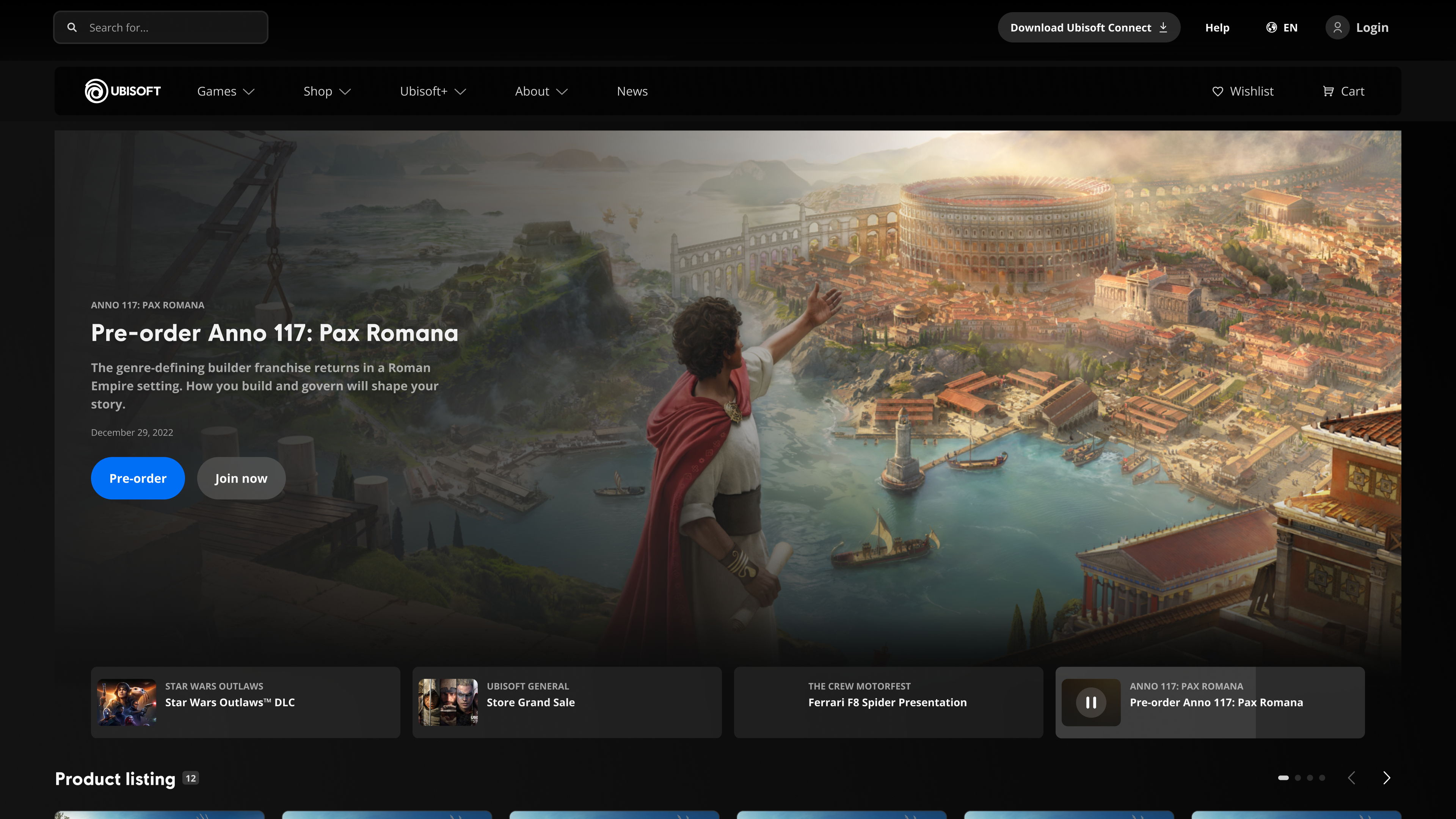
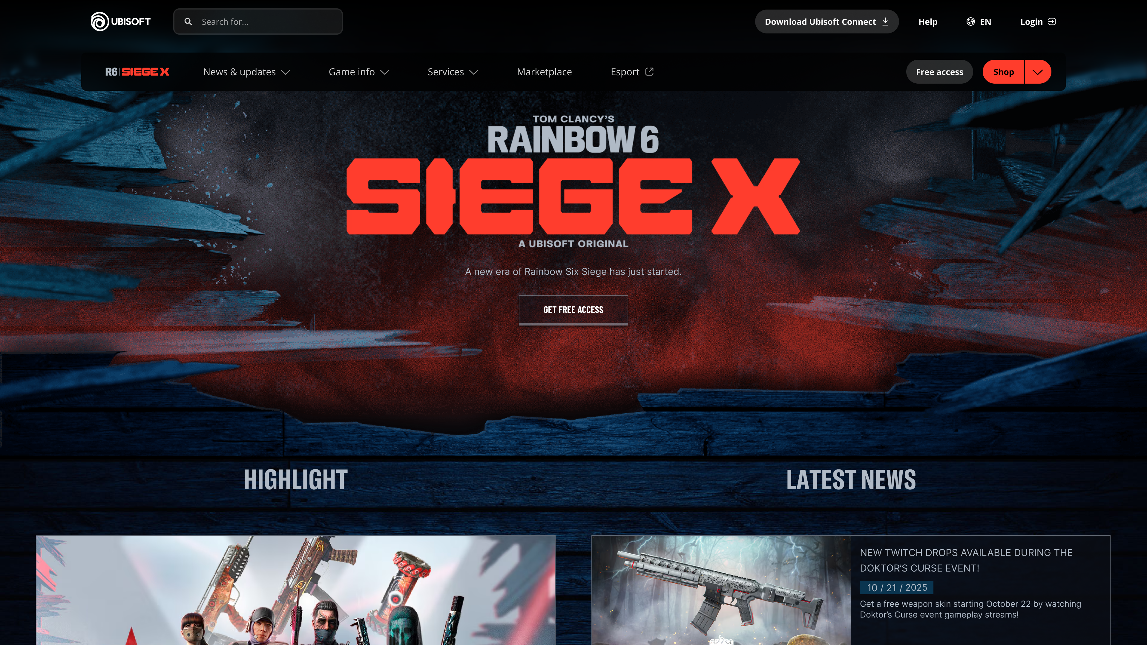
After the full design research process
Ubisoft.com & Store
Rainbow Six Siege
Navigation Principles
01
Unified Pattern Language
One consistent set of navigation components governs all Ubisoft web destinations — eliminating fragmentation and reducing design overhead.
02
Scalable Architecture
IA structure designed to accommodate a growing game catalog and new product lines without requiring a full restructure.
03
Player-First Wayfinding
Navigation organized around player goals, not internal org structure — reducing cognitive load and improving findability.
04
Responsive by Design
Components designed mobile-first, adapting fluidly across breakpoints without pattern fragmentation or parity loss.
05
Localization-Ready
Architecture and components built to support 20+ languages and right-to-left scripts from the ground up.
06
Accessible by Default
WCAG 2.1 AA compliance baked into base components — keyboard navigation, focus management, and screen reader support included.
OUTCOME
A complete, research-validated global navigation system governing information architecture, interaction patterns, and visual standards across all Ubisoft web destinations — currently in development.
← Portfolio
CASE STUDY 04
Global Navigation Redesign
One Navigation System, 50+ Properties
UX Strategy · Competitive Research · Interaction Design · 2025
NORTH STAR
Navigation should feel like one company, not fifty separate ones.
A research-validated system governing IA, interaction, and visual standards across every Ubisoft web property.
Ubisoft's global navigation is the connective tissue across 50+ web properties, but it suffered from inconsistent patterns, weak information architecture, and no unified research foundation.
CONTEXT
Identified that Ubisoft's navigation failed players because each property optimized for itself instead of for the player's journey across all of them. Led a 6-month effort to build the evidence base for that argument — benchmarking six gaming platforms, 24 research participants, and a design system that treats 50+ web properties as one product
MY ROLE
Over 6+ months we ran a rigorous multi-method discovery phase covering internal heuristic evaluation, competitive benchmarking across the six largest gaming platforms, stakeholder interviews, surveys, card sorting, tree testing, and usability sessions with 13 participants across desktop and mobile. Synthesized findings informed a revised IA and navigation structure, which we prototype-tested before incorporating all feedback into final designs for developer handoff.
PROCESS
50+
Web properties
mapped
24
Research
participants
6
Platforms
benchmarked
6 mo.
End-to-end
engagement
Design Process
01
Context & Problem Statement
Ubisoft’s fragmented web ecosystem is evolving toward a unified destination. A discovery phase was launched to redesign the navigation and lay the foundation for the future.
02
External Benchmarking
Analyzed navigation across EA, Battle.net, Steam, Epic Games, Xbox, and PlayStation — cataloguing IA patterns and interaction conventions.
03
Card Sorting & User Interviews
Synthesized research into a unified navigation taxonomy — standardizing labels, hierarchy, and cross-property wayfinding structure.
04
User Research & Validation
Ran moderated sessions with 24 participants across 4 rounds to validate IA structure, labeling decisions, and navigation hierarchy.
05
Final Designs
Delivered interaction specs, component documentation, and responsive behavior guidelines ready for engineering handoff.
Before the design research process
Ubisoft.com
Ubisoft Store
Assassin's Creed
Rainbow Six Siege
Heuristic evaluation
A heuristic evaluation is an expert review of a user interface against established usability principles. It identifies friction points, inconsistencies, and accessibility gaps before reaching users.
10 Usability issues were found on Ubisoft.com during the evaluation.
Severity ranged from Critical to Low
Critical
Download Connect button was not focusable
Fixed
Critical
Subcategories are visible on desktop but hidden on mobile
For revamp
Urgent
Missing focus state indicator on product cards
For revamp
High
Mega menu opens at hover
For revamp
High
Log-in button doesn't have a label
For revamp
Medium
Connect installer instantly downloads - lack of error prevention
For revamp
Medium
Mega menu buttons 'View all games' & 'View all' look the same but don't work the same
For revamp
Medium
Inconsistent hover states
For revamp
Medium
Inconsistent spacing and click zones
For revamp
Urgent
On mobile, Download Connect CTA still redirects to decommissioned Connect Companion app
Fixed
COMPETITOR LANDSCAPE
Persistent global header
Present on all pages
Ubisoft.com
EA.com
Battle.net
Steam
Epic Games
Xbox
PlayStation.com
Account access in nav
Sign in / profile link
Ubisoft.com
EA.com
Battle.net
Steam
Epic Games
Xbox
PlayStation.com
Search in nav
Global search in nav bar
Ubisoft.com
EA.com
Battle.net
Steam
Epic Games
Xbox
PlayStation.com
Cross-property consistency
Unified nav across all sub-sites
Ubisoft.com
EA.com
Battle.net
N/A
Steam
Epic Games
Xbox
PlayStation.com
Mobile nav parity
Equivalent mobile experience
Ubisoft.com
EA.com
Battle.net
Steam
Epic Games
Xbox
PlayStation.com
Supported
N/A
Not offered
Not supported on web
Analytics Findings
Analytics Findings
Navigation is used but fragmented
Global navigation drives discovery, while users rely on icons, logos and footer to complete key tasks.
01
Utilities outperform content
Download Connect, Search, Login and Language are among the most clicked items across the ecosystem.
02
Desktop=exploration | Mobile=utility
Desktop users browse games and franchises, mobile users seek quick access to support, account and services.
03
Gamesites act as hubs
Franchise and local navigations generate stronger engagement than the global nav.
04
Ubisoft.com is a jumping off point
Ubisoft.com acts as a dispatcher, funneling traffic into four primary channels: the Store (13%), Help (12%), Gamesites (10%), and the Marketplace (9%).
05
Journeys are non-linear
Heavy redirections between Store, Gamesites, News and Help, with Ubisoft.com acting as a traffic dispatcher.
06
Key Finding from the Discovery
Players engage through games, drive action by specific needs, and require unity.
Our next navigation must unify fragmented touchpoints, creating a single, consistent player journey across discovery, purchase, and play.
01
Players think by game, not corporate silos
Design must unify all content (news, store, support, DLCs) under a single, consistent game-centric experience.
Interviews
Card Sorting
Benchmark
02
Discovery and Purchase are distinct phases, but require a seamless bridge
Players naturally separate discovery (Ubisoft.com, Brand sites) from purchase (Store), yet expect a seamless bridge between both.
Interviews
Card Sorting
03
Ubisoft.com is mostly used as a service entry point
Visits are driven by core functional intent: Connect downloads, Marketplace access, and Account/Support management.
Survey
Analytics
04
Essential utilities must be ever-present
Account, Support, and Language are treated as always-on actions and must maintain maximum global visibility.
Survey
Interviews
Analytics
Prototype Test Results
High System Usability with Localized Friction
Functional Pillars Validated
Core utilities are Ready - News, Ubisoft+, and Account management achieved perfect success rates. The 85.7 SUS score confirms the framework is structurally sound; friction is localized to taxonomy and labels.
01
Steam/Epic Discovery Gap
Users expect a single flow to learn and purchase. 10 of 13 participants failed to find Coming Soon titles, expecting them on Home or Games rather than in the Shop tab.
02
Wishlist False Positive
While 11 of 12 found the wishlist, only 2 of 12 looked in the Profile menu - design success was masked by a scavenger hunt navigation pattern.
03
Search is a Primary Shortcut
5 of 13 players attempted search first for discovery; participants expect robust tools to bypass complex hierarchical navigation.
04
Corporate Silos Hide Content
Non-gaming media like Netflix content is invisible under the About label; 12 of 13 participants expected it elsewhere, such as in the news section.
05
Task Completion Overview
Score Card
Completion Rate: How many of the users were able to complete the task
Expectation Rate: How many of users expected to find the solution where it was
Next Steps: Action to take for the final designs
Task
Completion Rate
Expectation Rate
Next Steps
Find out what game is to be released next.
4 of 13
5 of 13
Change prototype
Look for other media or products (not games).
7 of 13
13 of 13
Change prototype
Find a way to check your wishlist.
11 of 12
2 of 12
Change prototype
Look for the Rainbow 6 Siege Marketplace.
12 of 13
13 of 13
Further research
Find a way to get information if you wanted to find a job in Ubisoft.
12 of 13
9 of 13
Keep as is
Find a section where you can resolve an issue for a game that you are currently playing.
12 of 13
11 of 12
Keep as is
Log into your account.
12 of 13
11 of 12
Keep as is
Seek the latest updates/news on Ubisoft games.
13 of 13
13 of 13
Keep as is
Seek information about Heroes of Might & Magic.
13 of 13
13 of 13
Keep as is
Find general information about Ubisoft+ Subscriptions.
13 of 13
13 of 13
Keep as is
Find a way manage your Account.
12 of 13
12 of 13
Keep as is
After the full design research process
Ubisoft.com & Store
Rainbow Six Siege
Navigation Principles
01
Unified Pattern Language
One consistent set of navigation components governs all Ubisoft web destinations — eliminating fragmentation and reducing design overhead.
02
Scalable Architecture
IA structure designed to accommodate a growing game catalog and new product lines without requiring a full restructure.
03
Player-First Wayfinding
Navigation organized around player goals, not internal org structure — reducing cognitive load and improving findability.
04
Responsive by Design
Components designed mobile-first, adapting fluidly across breakpoints without pattern fragmentation or parity loss.
05
Localization-Ready
Architecture and components built to support 20+ languages and right-to-left scripts from the ground up.
06
Accessible by Default
WCAG 2.1 AA compliance baked into base components — keyboard navigation, focus management, and screen reader support included.
OUTCOME
A complete, research-validated global navigation system governing information architecture, interaction patterns, and visual standards across all Ubisoft web destinations — currently in development.
Global Navigation Redesign
CASE STUDY 04
One Navigation System, 50+ Properties
UX Strategy · Competitive Research · Interaction Design · 2025
NORTH STAR
Navigation should feel like one company, not fifty separate ones.
A research-validated system governing IA, interaction, and visual standards across every Ubisoft web property.
Ubisoft's global navigation is the connective tissue across 50+ web properties, but it suffered from inconsistent patterns, weak information architecture, and no unified research foundation.
CONTEXT
Identified that Ubisoft's navigation failed players because each property optimized for itself instead of for the player's journey across all of them. Led a 6-month effort to build the evidence base for that argument — benchmarking six gaming platforms, 24 research participants, and a design system that treats 50+ web properties as one product
MY ROLE
Over 6+ months we ran a rigorous multi-method discovery phase covering internal heuristic evaluation, competitive benchmarking across the six largest gaming platforms, stakeholder interviews, surveys, card sorting, tree testing, and usability sessions with 13 participants across desktop and mobile. Synthesized findings informed a revised IA and navigation structure, which we prototype-tested before incorporating all feedback into final designs for developer handoff.
PROCESS
50+
Web properties
mapped
24
Research
participants
6
Platforms
benchmarked
6 mo.
End-to-end
engagement
Design Process
01
Context & Problem Statement
Ubisoft’s fragmented web ecosystem is evolving toward a unified destination. A discovery phase was launched to redesign the navigation and lay the foundation for the future.
02
External Benchmarking
Analyzed navigation across EA, Battle.net, Steam, Epic Games, Xbox, and PlayStation — cataloguing IA patterns and interaction conventions.
03
Card Sorting & User Interviews
Synthesized research into a unified navigation taxonomy — standardizing labels, hierarchy, and cross-property wayfinding structure.
04
User Research & Validation
Ran moderated sessions with 24 participants across 4 rounds to validate IA structure, labeling decisions, and navigation hierarchy.
05
Final Designs
Delivered interaction specs, component documentation, and responsive behavior guidelines ready for engineering handoff.
Before the design research process
Ubisoft.com
Ubisoft Store
Assassin's Creed
Rainbow Six Siege
Heuristic evaluation
A heuristic evaluation is an expert review of a user interface against established usability principles. It identifies friction points, inconsistencies, and accessibility gaps before reaching users.
10 Usability issues were found on Ubisoft.com during the evaluation.
Severity ranged from Critical to Low
Critical
Download Connect button was not focusable
Fixed
Critical
Subcategories are visible on desktop but hidden on mobile
For revamp
Urgent
Missing focus state indicator on product cards
For revamp
High
Mega menu opens at hover
For revamp
High
Log-in button doesn't have a label
For revamp
Medium
Connect installer instantly downloads - lack of error prevention
For revamp
Medium
Mega menu buttons 'View all games' & 'View all' look the same but don't work the same
For revamp
Medium
Inconsistent hover states
For revamp
Medium
Inconsistent spacing and click zones
For revamp
Urgent
On mobile, Download Connect CTA still redirects to decommissioned Connect Companion app
Fixed
COMPETITOR LANDSCAPE
NAVIGATION PATTERN
Ubisoft.com
EA.com
Battle.net
Steam
Epic Games
Xbox
PlayStation.com
Persistent global header
Present on all pages

Account access in nav
Sign in / profile link
Search in nav
Global search in nav bar

Cross-property consistency
Unified nav across all sub-sites
N/A
Mobile nav parity
Equivalent mobile experience
Supported
N/A
N/A Not offered
Not supported on web
Analytics Findings
Analytics Findings
Navigation is used but fragmented
Global navigation drives discovery, while users rely on icons, logos and footer to complete key tasks.
01
Utilities outperform content
Download Connect, Search, Login and Language are among the most clicked items across the ecosystem.
02
Desktop=exploration | Mobile=utility
Desktop users browse games and franchises, mobile users seek quick access to support, account and services.
03
Gamesites act as hubs
Franchise and local navigations generate stronger engagement than the global nav.
04
Ubisoft.com is a jumping off point
Ubisoft.com acts as a dispatcher, funneling traffic into four primary channels: the Store (13%), Help (12%), Gamesites (10%), and the Marketplace (9%).
05
Journeys are non-linear
Heavy redirections between Store, Gamesites, News and Help, with Ubisoft.com acting as a traffic dispatcher.
06
Key Finding from the Discovery
Players engage through games, drive action by specific needs, and require unity.
Our next navigation must unify fragmented touchpoints, creating a single, consistent player journey across discovery, purchase, and play.
01
Players think by game, not corporate silos
Design must unify all content (news, store, support, DLCs) under a single, consistent game-centric experience.
Interviews
Card Sorting
Benchmark
02
Discovery and Purchase are distinct phases, but require a seamless bridge
Players naturally separate discovery (Ubisoft.com, Brand sites) from purchase (Store), yet expect a seamless bridge between both.
Interviews
Card Sorting
03
Ubisoft.com is mostly used as a service entry point
Visits are driven by core functional intent: Connect downloads, Marketplace access, and Account/Support management.
Survey
Analytics
04
Essential utilities must be ever-present
Account, Support, and Language are treated as always-on actions and must maintain maximum global visibility.
Survey
Interviews
Analytics
Prototype Test Results
High System Usability with Localized Friction
Functional Pillars Validated
Core utilities are Ready - News, Ubisoft+, and Account management achieved perfect success rates. The 85.7 SUS score confirms the framework is structurally sound; friction is localized to taxonomy and labels.
01
Steam/Epic Discovery Gap
Users expect a single flow to learn and purchase. 10 of 13 participants failed to find Coming Soon titles, expecting them on Home or Games rather than in the Shop tab.
02
Wishlist False Positive
While 11 of 12 found the wishlist, only 2 of 12 looked in the Profile menu - design success was masked by a scavenger hunt navigation pattern.
03
Search is a Primary Shortcut
5 of 13 players attempted search first for discovery; participants expect robust tools to bypass complex hierarchical navigation.
04
Corporate Silos Hide Content
Non-gaming media like Netflix content is invisible under the About label; 12 of 13 participants expected it elsewhere, such as in the news section.
05
Task Completion Overview
Score Card
Task
Completion Rate
Expectation Rate
Next Steps
Find out what game is to be released next.
4 of 13
5 of 13
Change prototype
Look for other media or products (not games).
7 of 13
13 of 13
Change prototype
Find a way to check your wishlist.
11 of 12
2 of 12
Change prototype
Look for the Rainbow 6 Siege Marketplace.
12 of 13
13 of 13
Further research
Find a way to get information if you wanted to find a job in Ubisoft.
12 of 13
9 of 13
Keep as is
Find a section where you can resolve an issue for a game that you are currently playing.
12 of 13
11 of 12
Keep as is
Log into your account.
12 of 13
11 of 12
Keep as is
Seek the latest updates/news on Ubisoft games.
13 of 13
13 of 13
Keep as is
Seek information about Heroes of Might & Magic.
13 of 13
13 of 13
Keep as is
Find general information about Ubisoft+ Subscriptions.
13 of 13
13 of 13
Keep as is
Find a way manage your Account.
12 of 13
12 of 13
Keep as is
After the full design research process
Ubisoft.com & Store
Rainbow Six Siege
Navigation Principles
01
Unified Pattern Language
One consistent set of navigation components governs all Ubisoft web destinations — eliminating fragmentation and reducing design overhead.
02
Scalable Architecture
IA structure designed to accommodate a growing game catalog and new product lines without requiring a full restructure.
03
Player-First Wayfinding
Navigation organized around player goals, not internal org structure — reducing cognitive load and improving findability.
04
Responsive by Design
Components designed mobile-first, adapting fluidly across breakpoints without pattern fragmentation or parity loss.
05
Localization-Ready
Architecture and components built to support 20+ languages and right-to-left scripts from the ground up.
06
Accessible by Default
WCAG 2.1 AA compliance baked into base components — keyboard navigation, focus management, and screen reader support included.
OUTCOME
A complete, research-validated global navigation system governing information architecture, interaction patterns, and visual standards across all Ubisoft web destinations — currently in development.